Minimalism isn’t just a trend—it’s a necessity. As web content grows more complex, users demand seamless experiences that reduce mental strain and keep them engaged.
Minimalism fits the needs of many types of brands, including luxury brands that prioritize a clean and sophisticated image and technology and app brands that emphasize sleek design and efficient functionality. It’s also ideal for landing pages that focus on a single call-to-action.
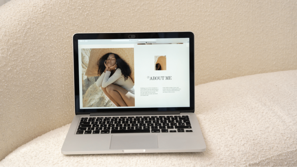
Aesthetics
Minimalism’s aesthetic is clean, crisp, and timeless. It’s often described as “spartan” or “restrained.” It also amplifies engagement, loads faster, and drives conversion rates. A streamlined design focuses the user experience on content, eliminating distracting elements that can cause confusion.
Another benefit of minimalism is that it forces designers to eliminate excess elements and clutter before a website becomes unmanageable. The practice is similar to sculpture through subtraction – perfection is achieved by removing all the unnecessary parts until only the essentials remain.
In addition, minimalist sites utilize negative space (the unused areas of a page) to allow for more visual impact. The result is a site that feels alive, not empty. Minimalism’s style is also a great way to highlight your brand’s logo and other important features without sacrificing readability.
However, it’s important to remember that not all users want a minimalist-style site. In fact, many users prefer a website that is easy to navigate and understand. Moreover, minimalist sites can be intimidating for those with cognitive or sensory disabilities. In these cases, it’s best to use progressive disclosure – a navigation strategy that reveals information in small chunks, rather than all at once – so that visitors can easily access the information they need. This ensures a seamless, intuitive experience for all users.
Usability
When compared with cluttered designs that feature a plethora of elements and content, minimalist websites are far easier to navigate. This is because intuitive navigation allows users to find what they’re looking for without being distracted by unnecessary information or design elements.
As a result, minimalism has become increasingly popular as a web design style that promotes better usability. Its focus on simplicity, clarity, and functionality aligns perfectly with modern user-centered design methodologies.
Minimalism also supports clear content hierarchy, which is essential for ensuring that users can easily understand a website’s structure and navigate its various sections. It also discourages unnecessary visual noise, such as flashy animations and other gimmicks that distract from the site’s overall message.
In addition, minimalism favors a neutral color palette, which helps ensure that the content takes center stage. It also utilizes whitespace (also known as negative space) to create a clean, uncluttered layout and to draw the user’s attention to important features like CTA buttons or headers.
As more and more business owners shift their marketing efforts online, it’s imperative to prioritize usability in order to attract and retain customers. Minimalism is the perfect approach to achieving this, as it provides an effective way to communicate a brand’s messaging and promote key conversions in an accessible manner. In a world where it’s all too easy to be distracted by the latest gadgets and flashy designer accessories, minimalism is a welcome reminder of the value of quality over quantity.
Clarity
Minimalism also allows designers to highlight the key aspects of a website without distracting users with extraneous visual effects. For example, the minimalism trend’s use of whitespace allows each section to stand out, while still letting the content remain the primary focus. This clarity allows users to easily navigate and absorb information, reducing cognitive load.
Minimalist websites are often responsive and use grid layouts, ensuring that they’re usable on mobile devices. This design philosophy also focuses on eliminating clutter by simplifying navigation and eliminating the need for additional icons or text. Combined with clean typography, these elements make for seamless user experiences.
Another aspect of minimalism is its use of progressive disclosure to guide users through a site’s content. Progressive disclosure uses collapsible menus, accordions, and tabbed interfaces to organize content in logical ways, preventing users from becoming overwhelmed by too much information at once.
It’s easy to see how minimalist web design is here to stay. Its simplicity, clarity, and functionality make it a great choice for modern businesses that want to present themselves in a professional manner. At Herbertus, we’re able to help our clients navigate the various design philosophies and find one that best aligns with their goals. Whether it’s an elegant responsive website or an agile, interactive app, we know how to create a user experience that works.
Efficiency
Minimalism’s surge in popularity isn’t just a design trend; it’s a philosophy that confers multiple concrete benefits for businesses. The streamlined, user-friendly experience offered by minimalist web designs encourages visitor engagement and increases conversions. In addition, minimalism is well-suited to mobile browsing. The reduced page sizes and streamlined navigation make it easier to create sites that look good and work well on all devices.
The clarity of minimalism lets the website’s core message shine, guiding visitors to where you want them to go and encouraging them to stay longer and engage more. Removing non-essential content and simplifying navigation also helps reduce cognitive load, which eases the strain on visitors’ brains. Strategic use of color can further help guide the eye to important elements, drawing the attention of the viewer where you want them to be.
Minimalism is especially well-suited to luxury brands, which want to convey sophistication and quality. Clean lines, limited color palettes, and simple layouts also lend themselves to tech and app companies that want to project a sleek and innovative image. Finally, minimalism works great for health and wellness brands, as it promotes the message of health and wellbeing in a calm and serene way.
Final Words
Venice Web Design services stand out by embodying the principles of minimalism that resonate with today’s digital landscape. By focusing on clean aesthetics, intuitive usability, and clear content hierarchy, we create engaging and efficient websites that enhance user experience and drive meaningful results.
Our approach not only prioritizes the needs of your audience but also aligns seamlessly with your brand’s identity. As businesses continue to shift towards a more online-centric model, choosing a design philosophy that emphasizes simplicity and clarity will ensure that your website stands out in a crowded marketplace. At Venice Web Design, we are committed to crafting solutions that not only look good but work well, providing a platform for your brand’s story to shine.